OPTIMUS
We redesigned the Customer Service Portal of an Indian banking major that would provide DIY support and assistance at every stage of banking to the user. The push was to automate the customer service process by enabling the user to complete banking processes where external support was not strictly neccessary. This was because contact centres had high support backlogs and multiple redundancies increased response time.
customer service portal
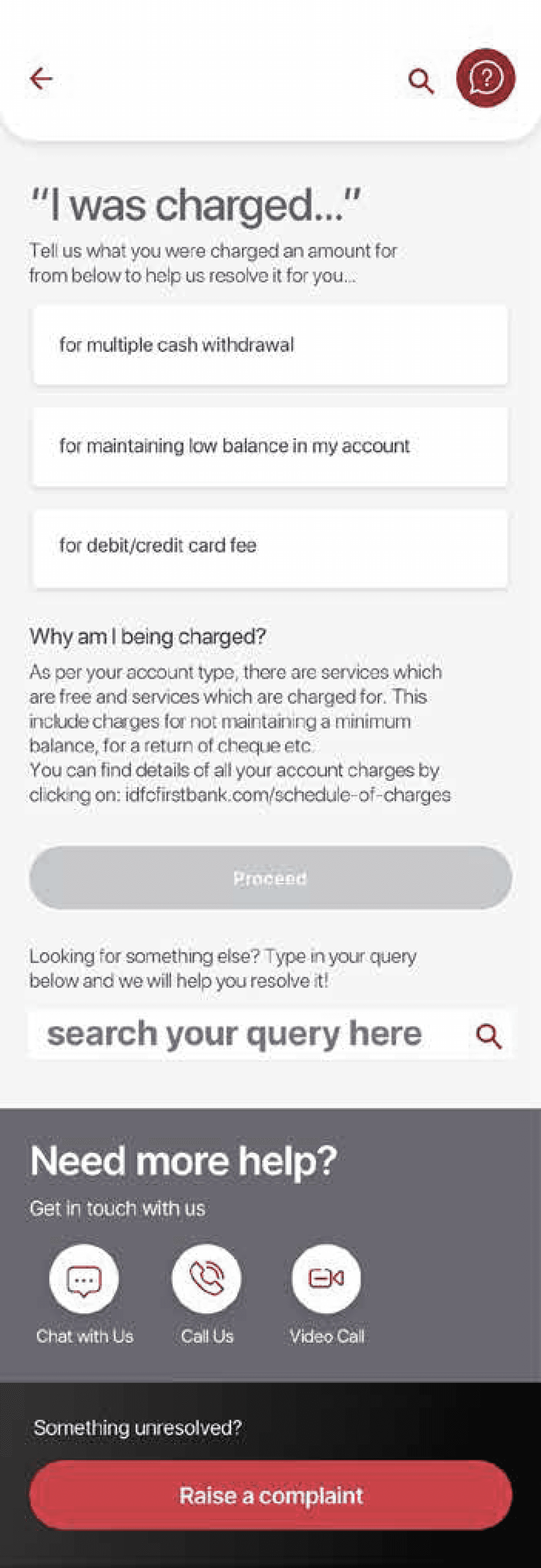

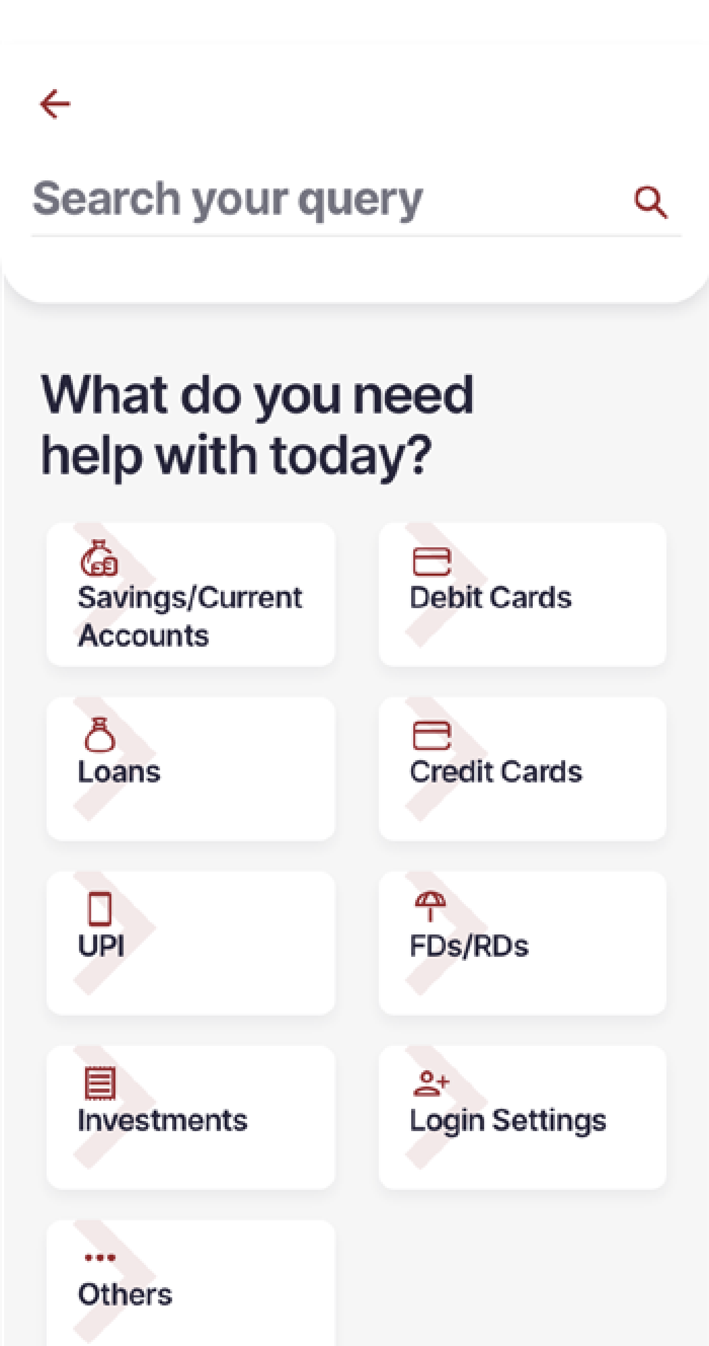
Existing and new customers of the bank that required assistance for processes which could be resolved through self-service.
User Personas
1.
Single sign-on to provide the user a personalized solution to their queries (e.g., info on specific charges, rather than schedule of charges)
For complex journeys (e.g., Transaction Dispute), ask one question at a time to reduce the cognitive load on customer. Display common reasons for issues (e.g., Uber)
2.
Clear explanation to placate customer's concerns, especially for critical journeys (e.g., charges, dispute transactions, block debit card)
3.
User needs
Expected TAT for open Service Requests displayed, along with reason / explanation for high TAT Service Requests
Customer support through chat (chatbot)/ get a call-back, before escalating, thereby solving customer pain-point faster, and avoiding a new complaint
Services / queries named using common words, in a conversational style
4.
5.
6.
Allow raising of complaints for
closed Service Requests
Engaging feedback at the end of every journey
7.
8.
arthi
We started the UX process by identifying and recommending 13 service changes across the customer service section. We arrived at these change recommendations by closely studying specific pain points for customers through analysis of historical data through “UX Teardown”.
We then analyzed the existing home application and based on the analysis, we identified alignment requirements for the customer service section and started incorporating the 13 changes through agile redesign and sprint-based iterations.
UX TEARDOWN
UNDERSTANDING THE CURRENT SYSTEM
In the UX teardown, we scored the customer service section based on the heuristic evaluation and mapped overall findings from the UX as well as UI perspective. We also specifically marked the sections and areas that were inefficient and needed improvement while also underscoring the processes involved in these sections.
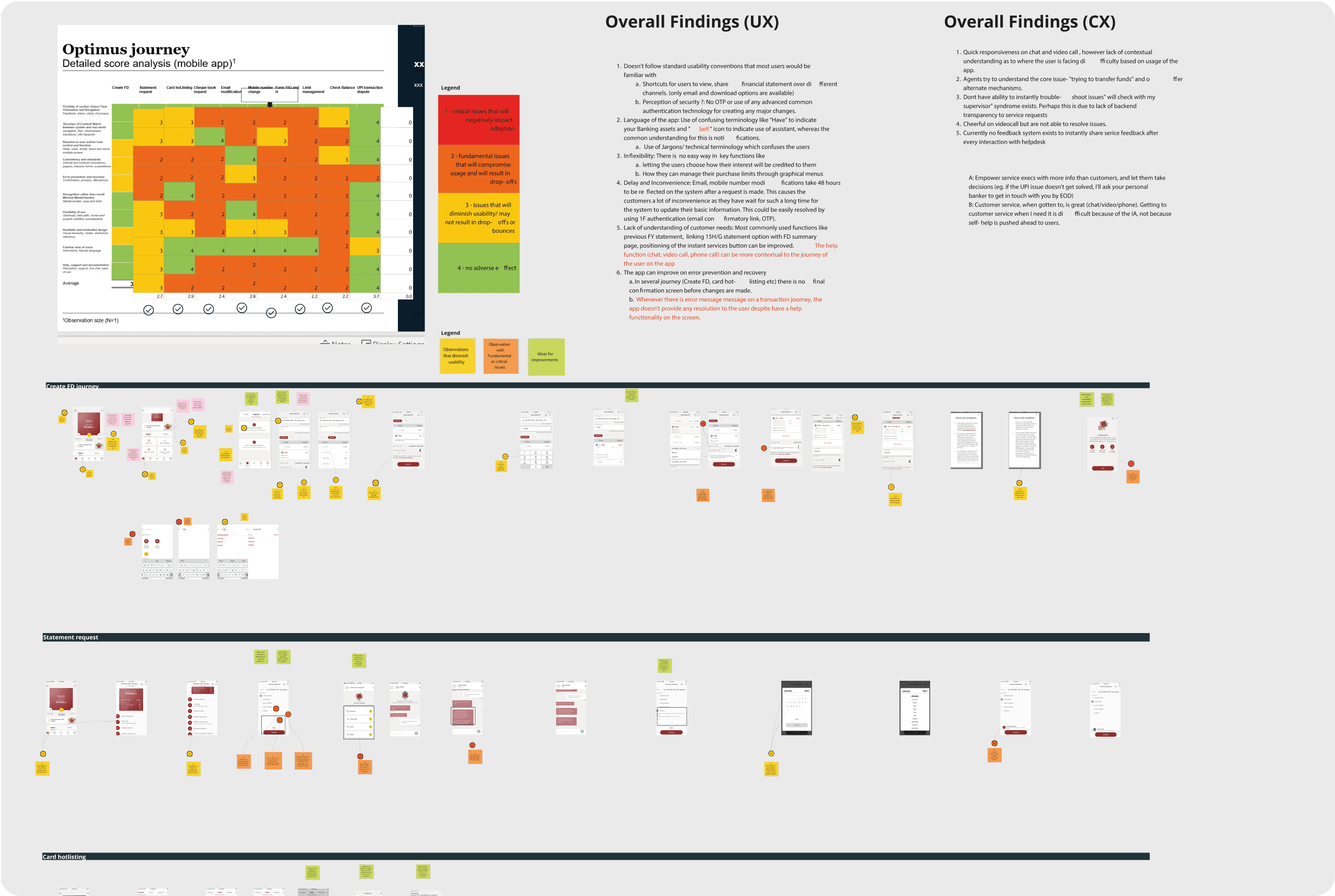
Scroll down to view the complete teardown
benchmarking
comparing with the best in class
We compared our current customer service section to recognized industry standards and exemplary examples such as Uber and Swiggy (a food delivery app). This analysis aimed to pinpoint areas that could be improved, offering valuable insights into how our product stacked up against others in the market. The findings from this benchmarking exercise enabled us to make informed, data-driven decisions to enhance the overall user experience of our product
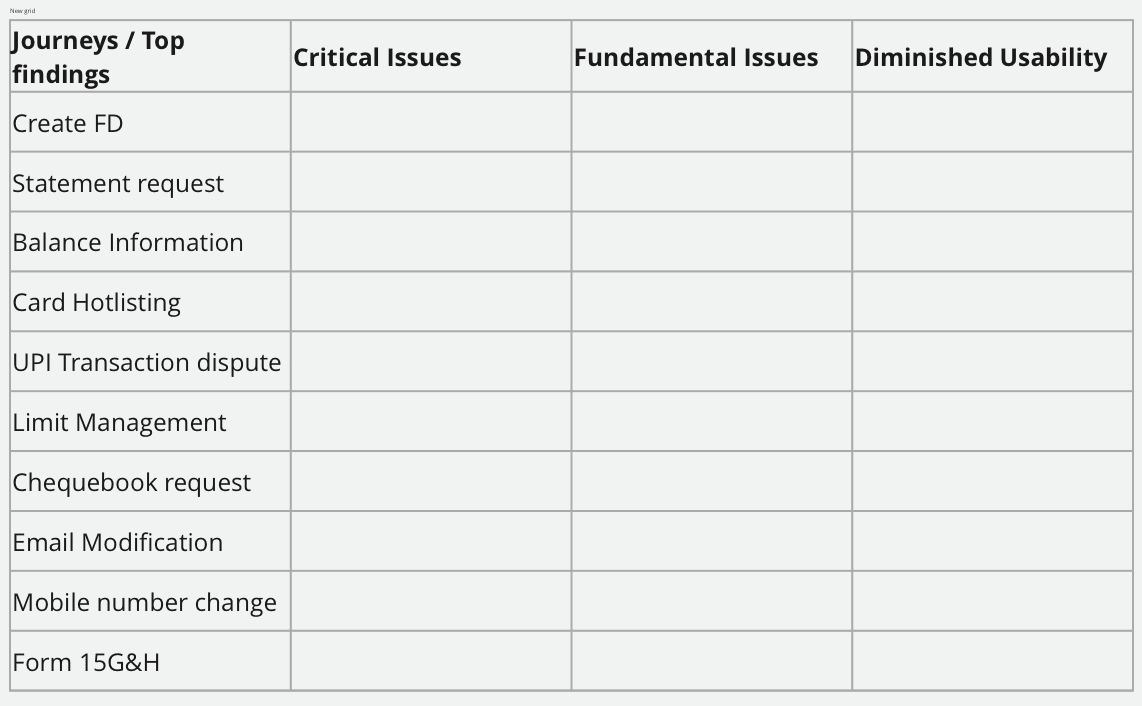
Mapping and building our findings per journey

Best in class customer service examples
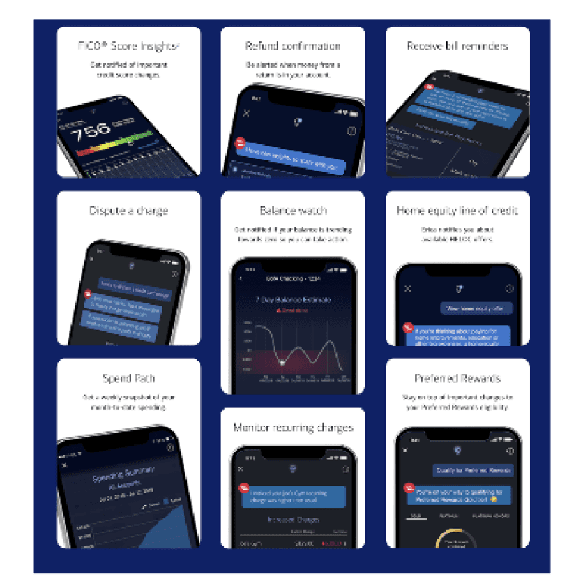
Erica Chatbot By Bank Of America: Erica acts as a financial assistant, helping customers with common issues without the assistance of a live operator. This drives down personnel costs, and the Al-assisted self-service ensures a successful customer experience.
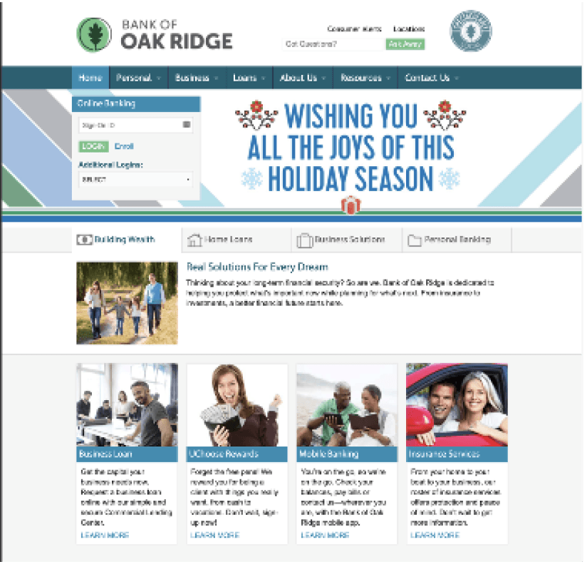
The Bank of Oak Ridge, a small banking enterprise in North Carolina, realized this. In addition to chat support. the bank offers financial calculators for planning finances.
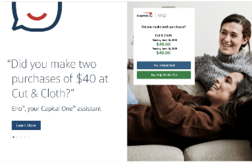
Coined as an "Intelligent Assistant" rather than an Al or a chatbot, Eno meets customers' needs by providing instant access to basic information and support, across any platform . Eno monitor.s customer accounts to send alerts, notifications, and insights when it detects irregularities.. Security and fra1ud checks are transformed into rapid customer touchpolnts. The onus is often placed orn customers to reach out with questions or concerns. But Eno actually offers up useful information to address customers' needs, helping them maintain visibility on their accounts.
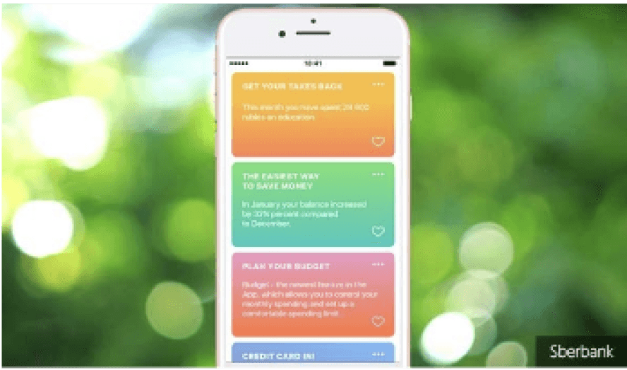
Russian-based Sberbank is leveraging the power of machine learning and artificial intellligence to help users control their finances better. Tips analyzes user data to draw conclusions from real--life situations and upcoming realworld events.
For example, Tips might track how much a customer spends at Starbucks or the grocery store and produce insights to help users budget more effectively. Tips even provides access to documents and addresses that may help with, for example, planning for a baby.
the navigation
existing user journey
The customer service section comprised of 4 major sections - Service Requests, Complaints, Feedback and Contact. We redesigned the happy flow of all these journey and additionally built transition journeys to connect every section to each other in order to help the user shift from one section to another seamlessly.
Use case example (Scroll right to view the complete journey)
“I was charged for maintaining low balance”

WIREFRAMING
defining the structure
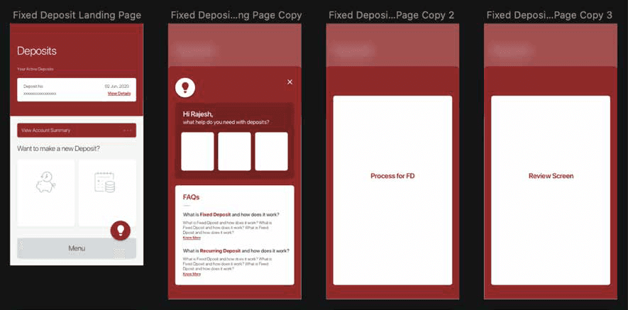
Involved the creation of a visual representation or blueprint of our product that served as a skeletal outline, illustrating the basic structure, layout, and functionality without incorporating detailed design elements.
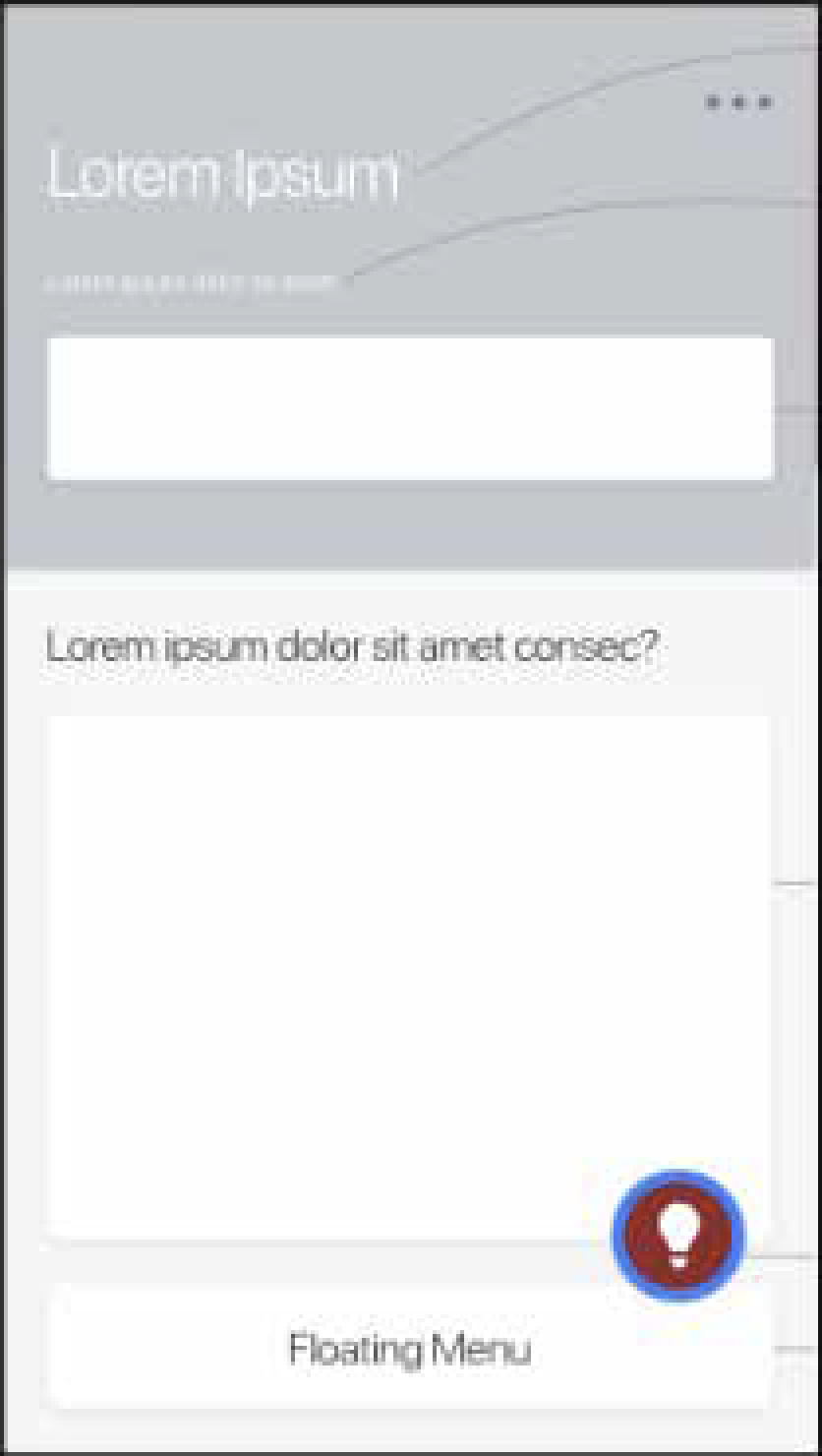
User information
Offerings from us
Floating Menu
User details with respect to the Service/Section
Offerings from us in the form of different services like open deposits, see transactions, history etc.
Help from us to the user, relevant to the content/data the user is dealing with, like educating the user, guiding them and assisting them with their tasks etc.
Help user navigate

UI
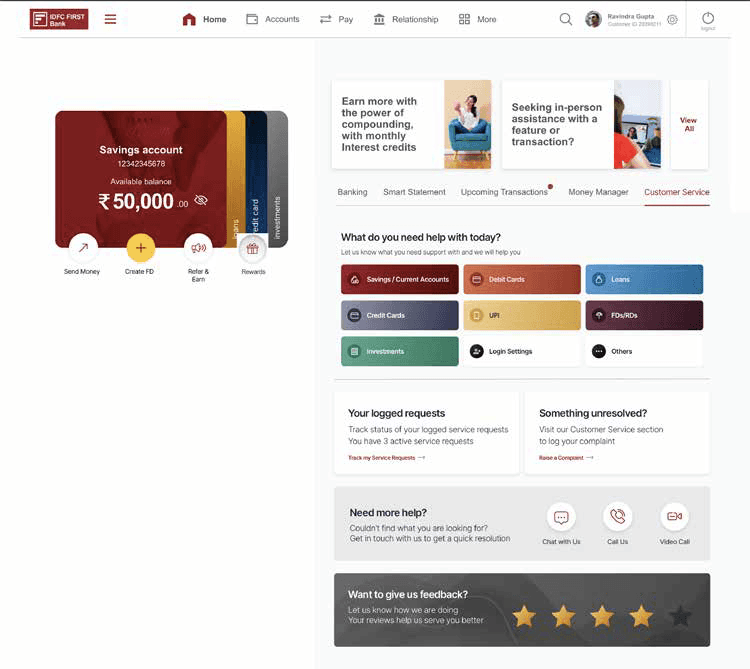
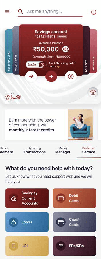
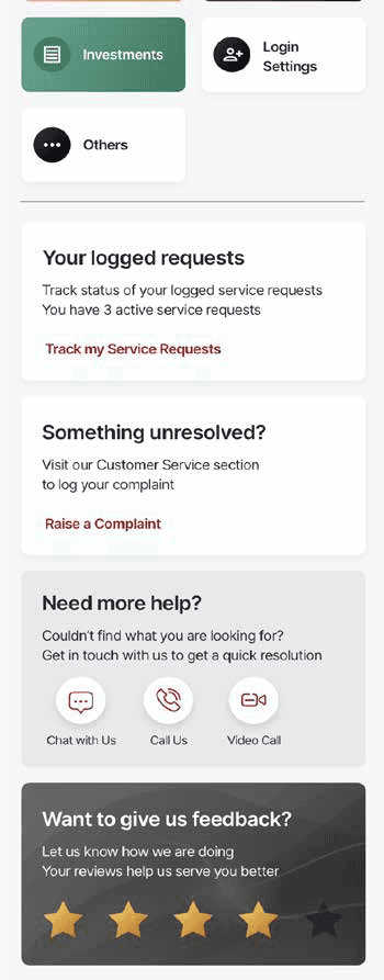
THE VISUAL DESIGN


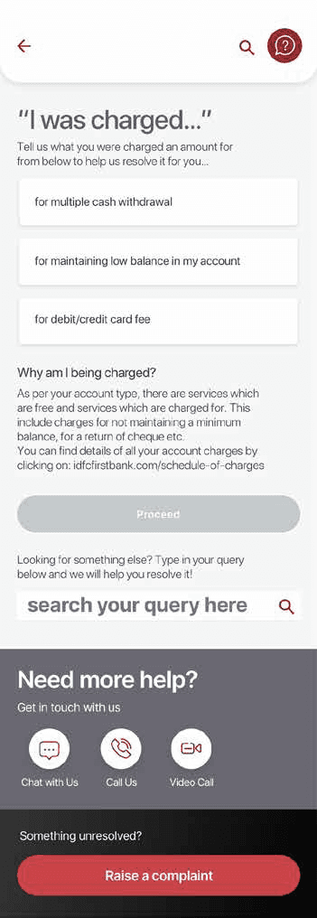

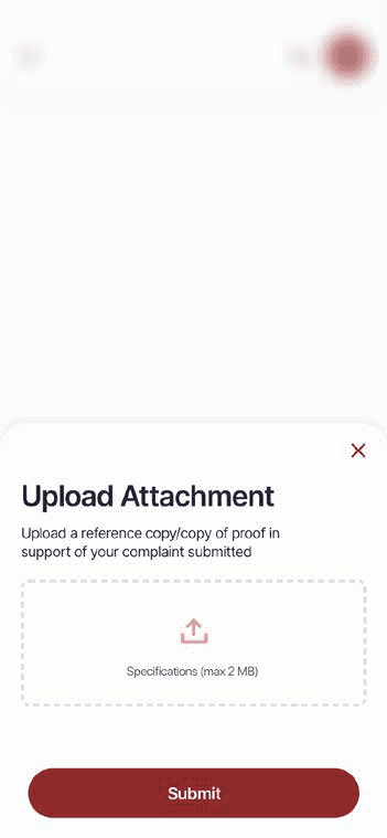
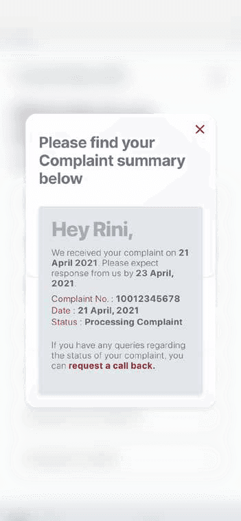
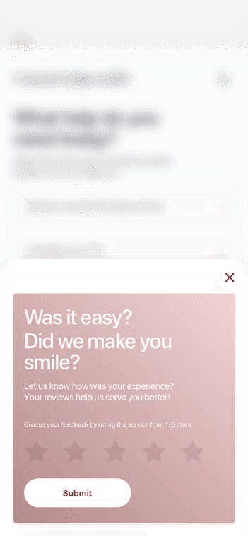
**This was a client project. Please contact for more details!


Scroll right to view the complete journey